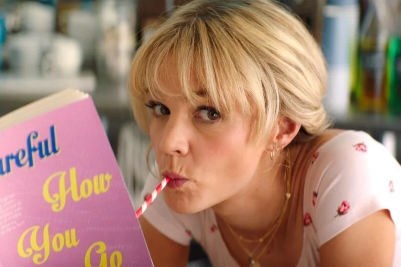
Carrie Mulligan in Promising Young Woman – Focus Features
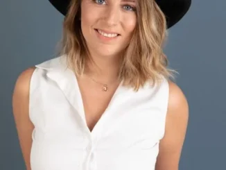
Liz Kloczkowski is an Art Director for TV, commercials, music videos, and film. She has worked on recent productions such as David Robert Mitchell’s Under the Silver Lake, Maria Pulera’s Falsely Accused, and the TV shows How to Get Away With Murder and Love Island.
In this interview, Liz talks about the unique set designs of Emerald Fennell’s recent award-winning film Promising Young Woman. Locations are often filled with candy color tones or a playful kitschy look that slyly belies the film’s dark and serious subject matter.
Let’s start with a general question about your background. Could you tell us a little about your past work, and what you see as the unique path that ultimately brought you to work as an art director in films and television?
I went to Ithaca College’s Roy H. Park School of Communications, majoring in cinema and photography, concentrating in cinema production, minoring in theater and journalism. I ended up production designing all of the student films across the years, and found a real love for it. I grew up painting backdrops for theater, and it just seemed like a natural fit. Ithaca does a Los Angeles program, where they set up students to work in LA (the biggest city to find work for cinema students).
I moved to LA, and the first designer I ended up meeting was David Snyder (he art directed Blade Runner, among many others). I trained under a few other designers who noticed my gift for problem solving and an aptitude for technology, and they helped me get into the Art Director’s Guild out here, where I could continue my training for film art direction. I met [production designer] Michael Perry through a decorator friend, who introduced us over pie, and the rest is history!
For those unfamiliar with the mechanics of set production design, what is the creative interplay and collaborative process like between the production designer, art director, set director, etc.? For example, in Promising Young Woman, in what particular ways did you collaborate with production designer Michael Perry, set decorator Rae Deslich, and costume designer Nancy Steiner to conceive the overall look of the film?
So the production designer usually does the overarching vision, they sometimes tell you verbally what they want, they email you references, or sometimes they do drawings. Michael does these small colored pencil drawings, or a rough sketchup for me. I’ll take that a little further, and develop the sketchup into a working model, and then review it with him.
We’ll throw in rough textures and set dressing to get the vision. We make mood boards of references, and discuss where we’re going with the director. I’ll export a few images, and then we will meet with Rae and talk about what the dressing should look like. I’ll go on director (location) scouts with Michael, Rae, and the director, DP, and producers, where we will talk about what each location needs. For Promising Young Woman, we didn’t get to tech scout every location, so Rae and I did a little two person scout to walk through the work for each location. At that point, I’m working with a set designer to get construction drawings out to Rae and the other departments, and director’s floor plans of all of our locations. Nancy is really her own department, she doesn’t need too much from us other than what colors and textures the sets are going to be. Most of the time that’s a conversation between her and Michael, but I’ll send her any renderings we have so she has an idea. Sometimes Costumes needs logos designed for uniforms, etc. The production designer keeps all the departments unified in look and vision.
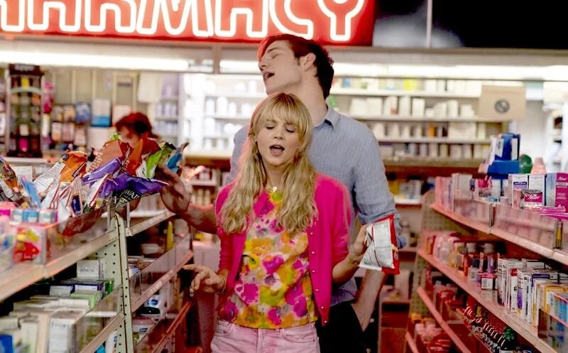
Carrie Mulligan and Bo Burnham – Focus Features
Much has been noted about the vibrant candy-colored visual look of Promising Young Woman in contrast to its dark subject matter. Director Emerald Fennell has said that she did not want “a film about a woman in a gray cardigan staring out of the window” (Hollywood Reporter). Costume designer Nancy Steiner has said, “when I spoke with Emerald, she really wanted this light, feminine, girly pastel world” (The Guardian). What was your initial impression, after first reading the script, regarding the approach for the art direction of the film? Did it differ greatly from the way it ultimately came together in the film?
So Michael did Murder She Wrote and Sweet Valley High, and it’s one of the reasons Emerald loved him. He loves pastels and pops of color, which was all over Emerald’s mood boards for Focus. The script is very darkly funny, so the contrasting innocent colors seemed like a devious little decision. We didn’t question any of it!
When you began to develop ideas for the film’s art direction, which other films or shows (or another form of media) came to your mind as possible templates or inspirations for this project?
We watched a lot of Murder She Wrote, (haha). There was also this short film done by Emerald and Ben (the director of photography) called Careful How You Go, which is another dark comedy. Emerald pitched us the project as Murder She Wrote meets Burn After Reading. They all also liked another of Michael’s movies, It Follows. Sort of a slow burn, with a unique, time period transcending look.
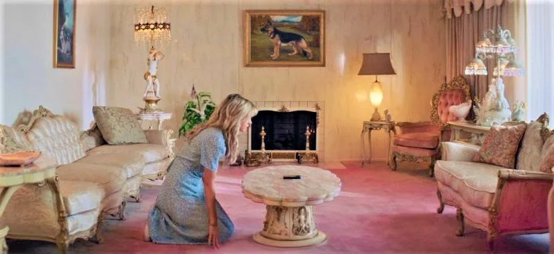
Heavy kitsch in the home of Cassie’s (Carry Mulligan) parents – Focus Features
Nearly every location in the film has a very specific stylized look to it. One standout is the suburban home of Cassie’s (Carey Mulligan) parents, with its very retro kitschy smoked mirrors, pink carpeting, Georgian-style furnishings, and even a 70s-looking thermostat. I’ve read that this location was already someone’s house that was location scouted, and the main production additions were the dog paintings and re-do of Cassie’s bedroom. What was your involvement and input for this particular location? Was it challenging to find ways to add character to a location that already had plenty of its own character?
I really wish we could take credit for that house. We hunted for a location for the character, and probably saw twenty houses, but none of them were right, Goldilocks-style. When we came across this house, it was just so great that we leaned into its current look, and supplemented with story related items. Rae really stood out here, knowing which furniture to keep, and which to replace. She actually brought a lot of stuff in, but the shell of the house, the pink carpet, and the couches were the location’s. It really depends on how close the location is to the original character — because we were in love with it, it helped us tremendously. It’s a fabulous memory to see Emerald running about the house, stating, “I LOVE THIS” or “THIS IS WICKED” or “OMGOSH YES”! Her energy was really inspiring.
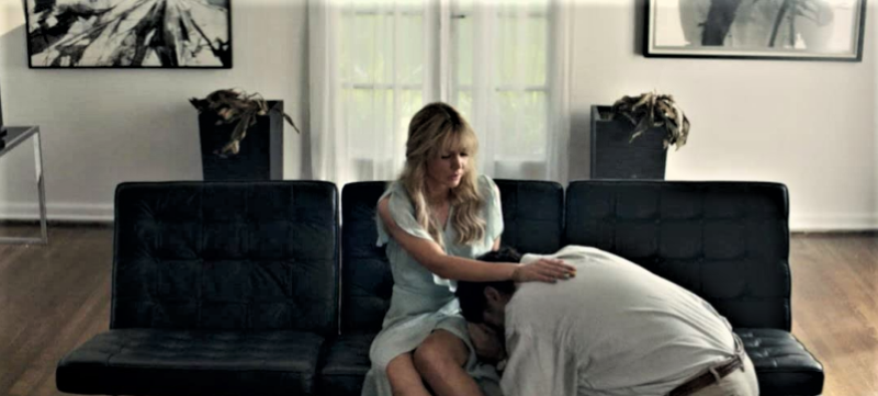
Carrie Mulligan and Alfred Molina – Focus Features
One set that stood out to me in stark contrast to others is the home of the tortured lawyer Jordan Green (Alfred Molina). His living room interior is all blacks and whites and grays, with mid-century furnishings and stark/harsh modern wall art (one of which to my eye resembles a rendering of glass shattered by a single bullet hole).
Due to the intense guilt he feels over his work as a lawyer defending accused sexual assaulters, he’s shut away and unable to sleep, and even his houseplants appear to be dead. What were some reasons/choices which led to the art direction for this scene? It’s a stylish yet bleak atmosphere and the scene begins very tense and menacing, yet it ends with one of the film’s most emotional and only truly redemptive moments.
Jordan’s character was that of a “high end lawyer, fallen from grace.” His modern apartment had fallen into disarray as he let himself go, and his guilt overtook him. This location was particularly difficult, as the whole house we shot in was in an abandoned building. We had to do a full repaint and restore it to life, which normally for art department is no problem, but it’s more difficult when you don’t have a lot of money in construction and dressing. Rae had to bring in every single piece of furniture and fixtures — a difficult feat when the budget is so low. The dead plants were an Emerald request, anything funny and dark was probably Emerald.
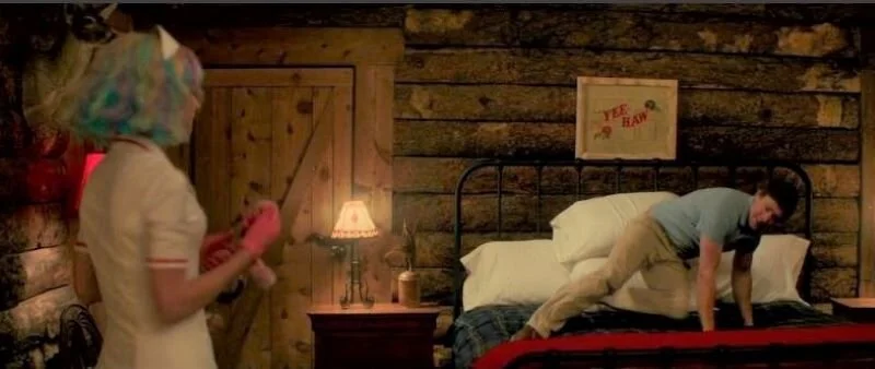
The cabin scene (Carrie Mulligan and Chris Lowell) – Focus Features
Kitschiness also plays another major but much darker role in the film’s climactic and shocking scene at the bachelor party log cabin. The cowboy hats on the bedroom wall and the “Yee-Haw” wall sign work to ironically underscore the horror of what ultimately unfolds there. “The log cabin in the woods” is of course also a well-established horror trope — were you and the others involved in the production design nodding to horror film locations in this scene? What other elements or ideas were involved in the creation of the look for this film’s startling sequence?
This was one of our only set builds — the cabin was a huge cabin that we converted into a bedroom. Emerald said there could be “never too much wood, tartan or regret.” Similar to the kitschiness of Cassie’s parents’ house, the cabin had to be an over-the-top-bachelor party. The “Yee-Haw” was another Emerald request — note here that the majority of this movie shows you Emerald’s genius. That little wooden bear was somewhere nearby, and Rae spied it and dressed it into the front door. The beauty of working on this project is that our department could have fun ideas, and Emerald would point the camera right at them, or frame our characters in front of them.
Other standard movie tropes are also played with throughout the film, such as revenge thrillers when Cassie is walking home with what seems like blood on her clothes but which turns out to be ketchup from a hotdog she’s eating, and classic romantic comedy in the cutesy lip-syncing to “Stars Are Blind” pharmacy scene with Cassie and Ryan (Bo Burnham) — these tropes are essentially misdirecting the audience in clever ways. From an art direction standpoint, what was it like to play around with the visual expectations audiences might have on first viewing, and in finding ways to subvert those expectations?
Most of subverting the audience’s expectations came from Emerald’s direction — we followed her lead. If she wanted something to feel horror, we’d go along with it. We directed a lot of our work at making the locations work within a shoestring budget, giving the shooting company stuff to work with, and making sure everything that she and Michael asked for was there.
What is your personal favorite art direction element of the film, i.e. a particular design construction for a scene, set, costuming, etc.?
Michael let me design the whimsical woodland wedding, so I’ll have to say that was my favorite. It was also a nightmare — the grass in the meadow was rather dead when we arrived to prep, so that was a big hurdle to cross. But when everyone showed up and loved it, that’s the most rewarding feeling to get while you’re on a project.
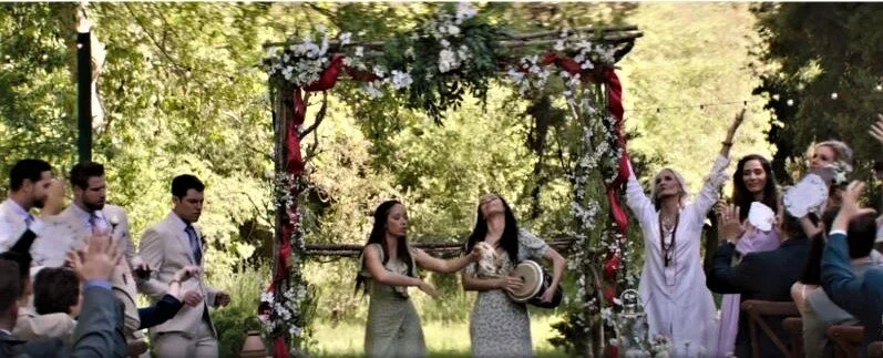
The whimsical woodland wedding – Focus Features
Overall, what has been an unexpected positive element of working on this film for you? For example, going into this project, did you have any sense of the widespread accolades it might receive (Promising Young Woman was nominated for five Academy Awards and won for Best Original Screenplay), or did it seem to you as if it might remain a little more under the radar?
We knew it was going places. It’s rare but it happens sometimes, when someone sends you a script and you finish it and say, “YES. I have to work on this project.” We made it work with what we had, and had a blast along the way. Emerald has a promising career ahead of her, she’s already working on so many amazing projects! Especially once my friends, family and peers started watching it, and reaching out to say how much they loved it, that was the best feeling ever!
Promising Young Woman is available to view


Be the first to comment