PIERRE EDOUARD
French photographer Pierre Edouard creates stark and minimalist images which frame both the natural world and architecture in striking large-scale compositions. In this interview, he discusses how the Covid lockdowns have impacted his creativity, the ways in which architecture has inspired him, how he uses spontaneity in his work, and why he favors depopulated imagery.
Interview by Megan Farrell
Much of your work involves travel to filming locations. How has the current pandemic impacted your ability to work normally? Have you made any changes to yourself by staying closer to home?
2020 [has been] trying for anyone. For my part, I was lucky to be confined in an apartment and to be able to go out for an hour every day to cool off. You are right to [emphasize] the [new] way of working and the modifications related to my subject. Since I could not move more than a kilometer from my place of residence either (due to confinement), I had to deal with what was around me. And it was a good experience. Indeed, it kind of pushed me to look at what is around me, to not see too far. Sometimes, what surrounds us is worth the detour. With that, I was able to practice, to experience nature photography, buildings, streets (deserted). Also, obviously without moving from home, I was content with the incoming light from the outside, the shadows [they] created. Two months in an apartment, twenty-three or twenty-four hours in it. It pushes [me] create, to think and rethink.
In your “North Trip” series, two of the categories are “Sky & Beach Series” and “Winter Textures.” These images are juxtaposed in interesting ways — were the wintry textures and beach scenes shot at the same time of year and in nearby locations?
Indeed, these two are juxtaposed in a way that we can believe in two different seasons in the same place. In the “Sky & Beach Series” we have wide angle photos, positioning us in a position of contemplation. In these photos we have a look at a distant horizon. In the “Winter Textures” series, on the contrary, we have a precise look at a detail. Here, the [up close] winter textures. To be honest, these two series were taken at the same time of year, mid-December, in Sweden, Malmö and Gothenburg. It’s quite funny that you think of this juxtaposition, with a photo we can bring different atmospheres. Go from a look at the horizon in the distance, a landscape, [then] to a look at a detail, a texture.
“Moon”
“Texture 1”
Your series names are all broadly titled: “Istanbul,” “Greece,” “North Trip,” “Netherlands.” Yet the majority of the photos within each series seem to be studies of specific locations and structures within those regions. Was there an intent on your part to keep the titles broad in order to guide the viewer to see what your camera focuses on within the larger context of the region? Could this alter the way that a viewer might ultimately perceive the wider region?
To tell the truth, the titles that I give to my series are not more studied than that. But after reflection, thanks to your question, we can perhaps see it as a feeling, a desire to want to guide the viewer to a place, an object, a geographical space so as not to lose it. It is true that I am never specific in the name of my series, I also explain this as a unwillingness to guide the viewer [so] that he does not have too many clues or details, that he can see the photo without necessarily concept on my part. May he be free to see what he wants.
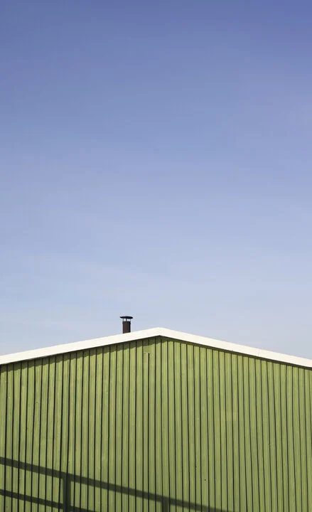
For example, I remain very concrete in the name of my intra-series, as for “North Trip,” it is the name of the overall series, but then I separated into three mini series: “Walls Series,” “Beach Series,” and “Texture Series.” By giving too much information in a title I think it directs the viewer too much. The way you see a photo, a painting, a movie or listen to a song will not be the same depending on the title. For my part, I try to be as concrete as possible in my titles, so I push the viewer to see what he wants to see. [Something] concrete, I think that’s what I want to express through my titles. Indeed, if the artist gives you everything in the title, you will see the work according to that and you will only think and see according to that. On the other hand, if the title is simple, concrete, once given, the viewer will not feel forced to see the work as the artist wishes, he will see the work as he wants it. I like this raw, simple, concise side. My photos are in the same spirit, [and] for the series of “Walls” it’s raw, [direct].
“Green Wall”
Architectural geometric shapes are a focus of a large portion of your work. What is it about these geometries that are so inspiring to you? What are some of your techniques when framing out a specific design detail on a larger building?
Indeed when you take a look at my work, architectural geometric shapes are a founding element. Architecture has always inspired me, I find it an incredible art where man takes the material in hand to do something big, magical. Architecture is an art where we play with space while also respecting the usefulness of the work, its function. Architecture is an art where we make something beautiful that normally might not be. When we look at the works of Frank Gehry we can see the aesthetic difficulty of these lines, curves, which however does not remove [anything from] the main function of the building. And this work takes place in a geographical space, trying to marry with what surrounds it or then by radically opposing it. Frank Gehry is for me a fundamental artist and a strong inspiration in my work. His vision of architecture, what I feel when I see, for example, the Walt Disney Concert Hall in Los Angeles (see my series “Los Angeles”), it’s more than a simple building in front of me, it he is a work, an aesthetic challenge, something beyond comprehension. When you are face-to-face with this artistic marvel you can only understand what I mean.
Architecture is a basis in my work because I see in it the osmosis between function and aesthetics, between fabric and nature, space and object. When I look at these works, my eye composes with space, these lines, these inspiring curves guide me towards a composition. It is a real pleasure to create compositions with an architectural building such as those of Frank Gehry, to compose, to create from these movements which are lost in the void of the infinite sky.
My technique is simple to capture a detail or a composition from a larger building. First of all as I practice, my eyes and my composition are refined. My eyes have become radars (aha), I am constantly looking for a composition in the street, from right to left, from bottom to top, it is an eye dance that takes place and leads me to create. The main research is therefore that of the place of the object (the building) in space (the sky). Then, once a composition has been found, here I am with my device working on the rendering. By trying to combine emptiness and fullness. Sometimes, I also place a silhouette, lost, tiny, that we barely guess, which gives a little more humanity to this photo. And also which gives a little more consistency to this game of full, empty, space, large and tiny.
“The Tiny Man”
The Los Angeles walls series is especially compelling, with its use of such bright and saturated colors running through the collection. Was there one specific building that caught your eye for its colors or form and acted as the impetus for you to continue shooting the series?
Los Angeles, a trip that allowed me to begin to perfect myself and find a style that I tried to have since [the time between] I was sixteen ( when I discovered photography) and eighteen (when I received my first camera). This trip literally changed my artistic vision — I found a vision that resembles me. For two weeks, staying at Westwood Boulevard, I saw myself walking, discovering this whole side of Los Angeles with each step, I was amazed. ‘Santa Monica’, ‘Westwood Blvd’, Malibu, ‘Melrose Ave’, oh!, this is it: ‘Melrose Ave’.
Here, one afternoon, I passed my time walking from street to street, from wall-to-wall. And here is the turning point for my series, the magnificent “Paul Smith’s Pink Wall.” There were people [standing] in this parking lot, but they were all there for one thing: to be photographed with the wall in the background. But here is the difference, I only saw the composition and the aesthetics of this wall when they saw just one: “I went here,” so [as] if [to] caption it for their Instagram. There was a mass of people for this photo. [But] in this parking lot my eyes were only riveted towards the sky, towards the top of this wall.
The weather was sunny (as it often is in LA), the sky blue. In this parking lot, I moved [around] a few minutes before being able to find the composition that suited me. I had noticed a green element above, which offered me pink, green and blue. Three colors. It was perfect, no need for more. And ever since then, I see myself composing with architecture.
The other key point of my trip was my visit to Grand Avenue, the Walt Disney Concert Hall, by Frank Gehry, a masterpiece. I had so much fun photographing [it], composing…and also, next door is a beautiful building, the museum of modern art: The Broad. Same, an eye delight. So these are three buildings that drove me radically to do the wall series in Los Angeles and also that made me discover and find my style.
“Pink Wall”
“Walt Disney Concert Hall”
Do you extensively scout locations before you shoot them, or is the process more one of spontaneous discovery as you move along through an area?
No, spontaneity is my working tool. It pleases me to be able to wander in an unknown space, to discover, never to foresee where I will go. Yes, maybe I miss some beautiful buildings during my travels because nothing was planned, but I don’t care, I [have] never regretted my spontaneous walks. And then that will push me to go back. For me, a trip must be spontaneous — a discovery is much simpler. If you organize or plan something, know that you will never do what you planned. So I favor the unknown.
Your photographs are all [mostly] depopulated. The emphasis is purely on structures and landscapes and colors and textures. Is it a deliberate move on your part to keep people out of your frames? We are viewing are the remnants of human works instead of any actual people. What is your intent with this approach?
Indeed, my approach is, most often, to favor depopulation. Because for me, the buildings remain when the man does nothing but pass. If there is no more human life, there remain the structures, the fabric, the materials. And that’s also what I want to convey as a message, the idea that architecture is eternal. Man builds for later, a sort of trace of passage, an eternity. A testimony in space time. Also we can see a kind of frozen time, frozen space in my photos. Because there is no human testimony, of life in my series. As if humanity had been depopulated. As if I were in a ghost town far from civilization, caught in a dimension between recent past and future. So yes, I try to privilege the human void.
The “Buildings Series” in the “Netherlands” series is a pure focus on industrial and geometrical architecture. Most people think of the cliche tulips and canals when they think of the region. What was it that made you take a different focus for the series, rather than also include any of the more iconic imagery that Is usually associated with the region?
This is exactly what I do, also taking the tourist side of the cities in which I find myself against the grain. As with the anecdote on “Paul Smith’s Pink Wall”, all these tourists were there to take their photo in front of the wall, not highlighting the wall but [only themselves]. While I, on the contrary, highlight what seems, in the eyes of the majority of people, just an architectural element, a wall. Therefore, my approach to the Netherlands was not to take pictures of these tulips or these canals. My approach is not touristy but artistic. [To] make visible, the invisible. Also, in relation to my titles which we spoke about previously, I do not wish to share the place and the location of these photos for the sake of protection towards these places. Mass tourism gives me a headache, let’s stop advertising what surrounds us, rushing to “trendy” places.
Story time: Recently I was walking on the French Brittany coast, and there I could see a mass of people, I approached and I could see that they were all trying to reach a beach ranked seventh most beautiful beach in Europe. And this beach was now closed. The cause? Mass tourism. Indeed, the fact that more people came to this beach had created a significant risk of rock falls and landslides. Stupid. Because this place is magnificent. A few minutes later on this coastal path I was able to meet two tourists, one walking in the middle of the protected flora and her friend picking flowers which are also protected. And they took pictures of themselves, posing in this protected floral space. So I stopped and told them about the mentioned “protected natural space” which aims to take care of the environment. They agreed. [But] a few yards away, [I turned] around, and they were still there. It’s the same everywhere in the world. So in my titles I do not say [specifics], and also in my Instagram posts I do not say where the photo was taken.
“Train Station Roof” (Netherlands)
“Halo Building” (Netherlands)
Who are some photographers that are prime influences on your style?
It seems correct to me to say that I am not necessarily influenced by photographers but by encounters, people, arts, objects, situations. Everything is a dose of inspiration. So there are certainly photographers in my inspirations, but I also think I can draw this inspiration from everything that surrounds me. As we were able to talk about previously, architecture inspires me a lot and especially the work of Frank Gehry, whether it is the museum in Bilbao or the Walt Disney Concert Hall.
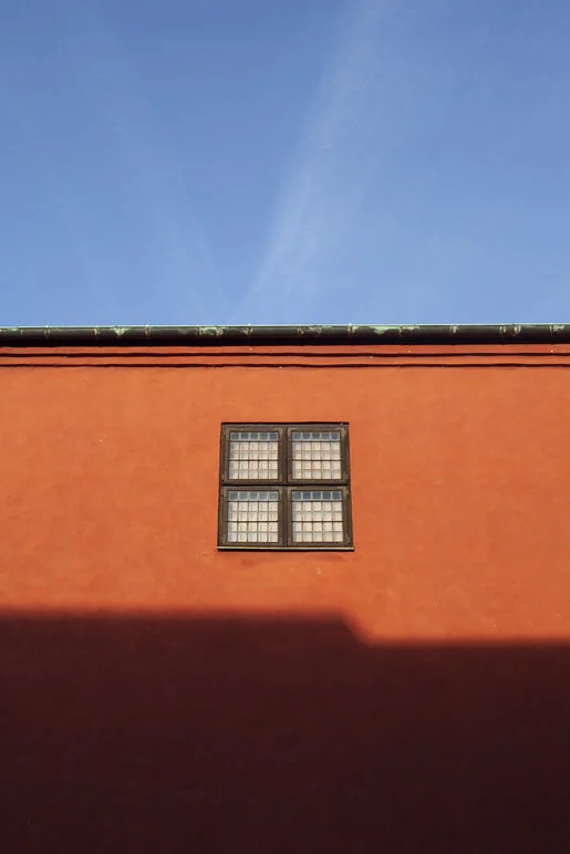
Painting is also a source of inspiration, artists such as: Edward Hopper and his work on loneliness, the conflict between nature and the modern world, its colors; Mark Rothko, for his colors, his pictorial compositions, the lines, which can be found in my photographs (for example the photograph “Orange Building”) and of course, Piet Mondrian — how to speak of structure, lines and colors without speaking of him! On the photography side, I don’t have as many inspirations, but first of all I would talk about my father, because he was the first to introduce me to photography, to give me my first camera, to give me advice, to push me and to teach me photography. Also, I would say that some renowned photographers inspired me without necessarily in their style — but in the technical and historical side — I can quote Walker Evans, Diane Arbus, Brassaï and Eugène Atget.
“Orange Building”
There is [very] little biographical information available for you. What is one unique thing that you would like people to know about you?
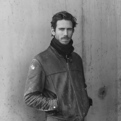
Pierre Edouard, it’s [actually] my first name — normally they are linked by a hyphen but for my artist name, I separated them. Here I am, already, in my twenty-seventh year. Born in Paris, currently I am a graphic designer based in Nantes. My goal is to create from my photos a series and to be exhibited, so if you are interested, have advice, have a project to propose or want to know more, go to my portfolio site and contact me!
See you soon and don’t forget: look up.
You might also like our interviews with these photographers:
Megan Farrell is a writer and filmmaker who lives in New Jersey. She has recently graduated from the University of Alabama with a dual degree in Telecommunication/Film and Economics. In her spare time, Megan enjoys amateur photography and playing tennis.


