The symbolic languages of LISA MYERS BULMASH
Seattle-based artist Lisa Myers Bulmash creates collages, assemblages, and altered books focusing on African American and female experiences. She writes that her works aim “to expand the classical practice of using an individual narrative to illuminate the general human condition. My hope is that my symbolic language creates a much-needed magic for the viewer — especially those who experience a daily sense of erasure or isolation.”
She is currently showing work from her “Not Geo” series at Morton Fine Art’s group exhibition Creating a New Whole, up through February 4, 2023.
Interview by Interlocutor Magazine
What initially attracted you to the art form of altered books? Was there a particular exhibit or artist working in the medium that catalyzed you to begin experimenting with it?
Being a longtime bookworm, I think my attraction sprang from a horrified fascination. Here was an object I’d been taught to treat with care, almost reverence – but someone had cut right through the cover! Pages were missing and rearranged! Then I realized the book was still telling a story but speaking in a different way.
What types of books do you focus on for alterations and why?
Sometimes I’m actually judging a book by its cover: does it have an interesting texture, design, or a title that catches my eye? They’re always hardcover books, usually smaller than the average coffee table book but larger than a paperback. The book needs to be sturdy enough to support whatever lightweight, three-dimensional objects I add to it, plus the hanging hardware on the back. (Most of my altered books are wall-mounted.) I also look for books that are no longer under copyright, just in case I salvage one of its illustrations or text for another project.
There Is No White Without Black - Altered book diptych (pair) - Free-standing objet d’art, 7.75 x 21.5 x 1.75 inches - Hand-carved niches; covers and text block (pages) sealed closed
Could you talk about your typical methods of book alteration and what elements of the book itself you often focus on to change? Does the book's text directly come into play within the work (i.e., do you directly reassemble any textual elements)?
First, I flip through the book to see if there are any pages I want to cut out and save. Then I seal part or all of the page block. I use a utility knife to cut a hole in the front cover. Then I cut into the page block, using my fingers to tear a rough niche down into the page block. The niche acts as a focusing device for the image or images I insert into the book.
It’s actually pretty rare for me to reassemble the textual elements of the original book into the resulting artwork, unless there’s a chapter title or phrase that stands out for some reason. I once altered a copy of Robinson Crusoe, thinking that the adventure story associations would make interesting commentary on an image of two little Black boys in the hand-torn niche. The kids would hover just behind a chapter title of “I have a terrible dream.”
The thing is, when you’re working with material this old (the novel was first published in 1719), there’s bound to be some casual racism and colonialism in the text. I pulled out text that read, “he set my foot upon his head,” a clear description of Friday’s submission to Crusoe. Added to the “terrible dream” text and the Black boys, the piece then became about anti-Black violence.
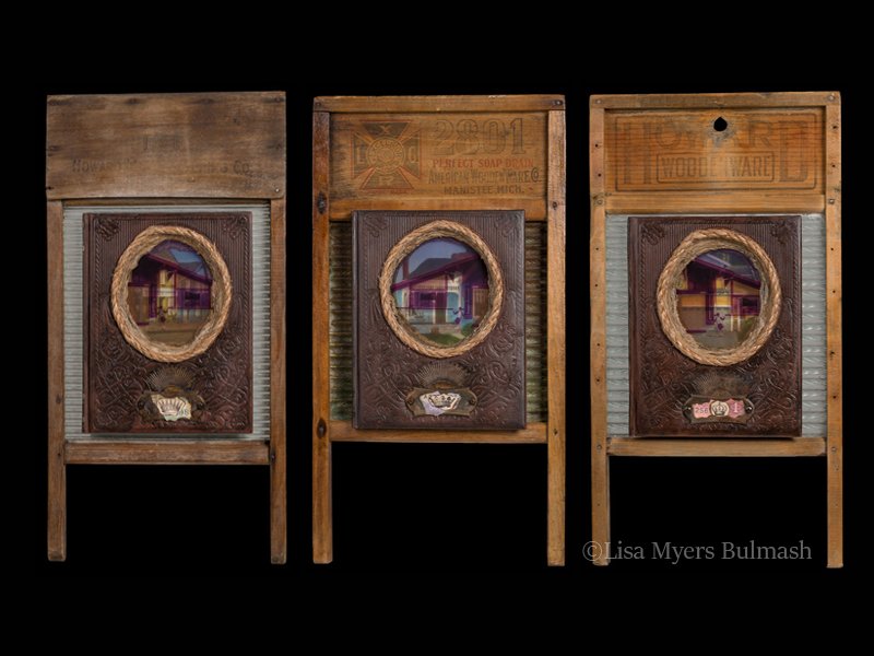
Bought & Paid For #1-triptych (trio) of altered books, mounted upon antique washboards - Hand-torn niches framed with rope - 24 x 13 x 2 inches
You've written, “as a visual artist, I am obsessed with joining elements that seem to have no relationship to each other.” What do you think the origins of this obsession are, and what do you believe is the most potent aspect of joining disparate elements?
The cognitive clash between two unrelated elements is exciting and often amusing – when a potential combination makes me cackle with delight, I know I’m onto something worth exploring. I couldn’t say exactly what the origins of the obsession are. But I believe the most potent aspect of joining disparate elements, as you say, is the feeling that I’ve manipulated the materials in a way that compels them to give up some sort of hidden meaning or potential.
TODAY, America. Today. Collage on hardback book cover - Wall-hanging objet d’art - 16.5 x 18.5 x 1.5 inches
The Mountain - Original collage on Fabriano Artistico watercolor paper - 100% cotton paper: hot-pressed (smooth surface) and acid-free - 12 x 9 inches unframed
You are a part of the group show Creating a New Whole at Morton Fine Art, where works from your “Not Geo” series are offered. Could you discuss this series and how it aims to subvert National Geographic's problematic depictions of Africans and non-Western people?
As humans, we still have a tendency to think if something’s written down (and illustrated, bound into a magazine and delivered to our doorstep), then it must be at least partly true. I think that holds true in virtual spaces too, even though an algorithm is producing content tailored to our own biases and interests.
The “Not Geo” series pushes back against taking things at face value, and the kind of categorization that harms Black people and others of color. The old illustrations were meant to be pseudo-scientific depictions of human “types” separated by racial boundaries. It indicates a certain inflexibility of thought, a hardness matched by the harshness that people of African descent have often had to endure. I wanted to counter that with the delicacy of lace paper and irregular patterns in marbled paper. It’s my way of supporting the radical notion that Black people, especially women, should be treated with justice, empathy, and a certain softness that the world rarely extends to us.
Not Geo - Girl, 2022, ink, hand-marbled and rice paper collage on watercolor paper, 12 x 9 in
Not Geo - Woman, 2022, ink, hand-marbled and rice paper collage on watercolor paper, 12 x 9 in
Not Geo - Crossed Arms, 2022, ink, hand-marbled and rice paper collage on watercolor paper, 12 x 9 in


